4 Types of Employee Monitoring Software: What SMBs and IT Providers Actually See in Each Category
A practical guide for SMB owners and IT service providers: what the 4 main categories of employee monitoring software actually show you, how they differ in data depth and day-to-day usefulness, and why choosing the right category matters more than just comparing feature lists. No legal advice.
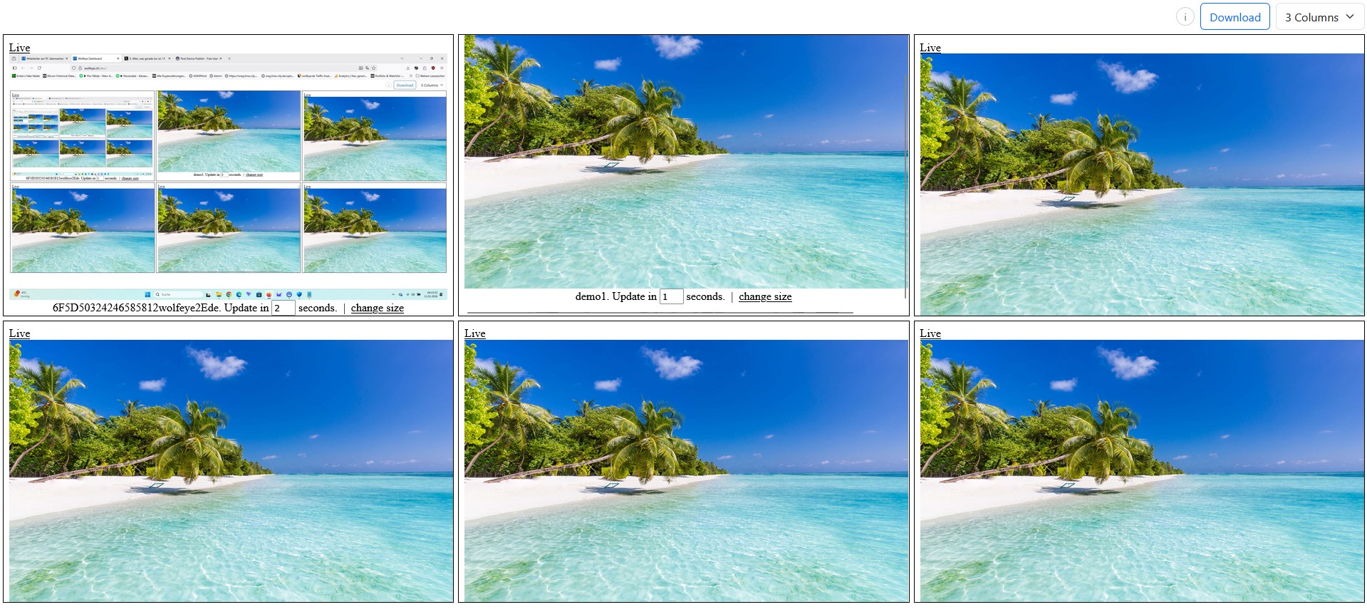
Illustrative Wolfeye grid view on company-controlled PCs. This article explains technical categories only. Whether monitoring is lawful in your country, for your use case, and under which conditions users must be informed or must consent depends on applicable laws and contracts. Always obtain legal advice before deployment.
Many SMB owners and IT service providers use the phrase employee monitoring software as if it described one single type of tool. In reality, that is misleading. The market includes several very different categories, and they do not show you the same thing. Some mainly show hours and activity levels. Some focus on website and application reports. Some go very deep into events and data collection. And some let you see the actual screen itself in real time.
That difference matters a lot when you are deciding what kind of visibility you actually need for your company or for a client. A business owner who only wants rough time blocks does not need the same software category as an IT provider who wants to see live screens on selected company-controlled PCs. Likewise, a team lead doing onboarding or QA checks has very different needs from an organisation looking for deep forensic logs.
This is why a post about the 4 types of employee monitoring software is so important: it gives buyers a real framework. Instead of comparing random features from random vendors, you first understand the category itself and the kind of output each category produces.
In practical terms, the four common categories are:
- Type 1: simple time tracking tools,
- Type 2: application and website usage reporting tools,
- Type 3: deeper forensic-style monitoring tools,
- Type 4: live screen viewing tools such as Wolfeye Remote Screen.
Important: this article is for general technical and organisational information only. It is not legal advice. Laws differ from country to country, and lawful use also depends on your use case, your contracts, your internal policies and, in some situations, whether users are informed or whether consent is required. Before you deploy any monitoring software, always obtain qualified legal advice in all relevant jurisdictions.
1. Why saying “employee monitoring software” is too broad
The phrase sounds simple, but it hides very different technical models. That creates confusion for buyers. One vendor may show clean timesheets. Another shows summaries of websites and apps. Another records a huge amount of user activity. Another shows the live screen itself. All of those are often marketed under the same general label, even though the operational experience is completely different.
For SMBs and IT service providers, this confusion creates two practical problems:
- They buy the wrong category. A company may think it needs “monitoring software” when it really only needs live visibility for training or QA. Or the opposite: it may buy a live screen tool when it only wanted simple activity blocks.
- They compare tools before comparing categories. That often leads to poor decisions, because the real question should come first: what kind of information do we actually want to see?
That is why category clarity matters more than feature overload. Once you understand the four main categories, many buying decisions become much easier. You stop asking “which tool has more buttons?” and start asking “which category gives us the right operational visibility without unnecessary complexity?”
This is especially important for the kind of buyers Wolfeye serves: SMBs and IT providers/MSPs. These buyers often want a practical solution that fits a real use case such as onboarding, QA, remote visibility, supervisor oversight or support triage. They do not necessarily want the deepest or most invasive software category. They want the right category for the job.
Example of a multi-PC dashboard context. In practice, what you see depends on the category of monitoring software you choose: time blocks, summaries, deep logs, or actual live screens.
2. Type 1: Simple time tracking tools
The first category is the simplest one. These tools are usually designed to answer questions such as:
- How many hours did someone work?
- When was the user active on the computer?
- Which time blocks were productive or active?
What you actually see: in this category, you generally see time-based information rather than detailed computer context. The dashboard often shows hours worked, active vs idle time, shifts, timers, or simple activity percentages. It may tell you that a user was active from 09:00 to 11:30 and again from 12:15 to 17:00, but it usually does not show you the actual screen content.
What it is good for: simple timesheets, rough activity tracking, basic workforce reporting, and lightweight billing or attendance workflows.
What it usually does not give you: deep operational context. If a manager wants to know what the user was actually doing, time tracking alone often does not answer that. It can tell you that someone was active, but not whether they were in the right system, following the right process, or stuck on the wrong screen.
That is why time tracking is often best for companies whose main question is time, not screen-level visibility. If your core management question is “how long was somebody active?”, this category may be enough. If your question is “what is actually happening on the PC right now?”, then you probably need a different category.
3. Type 2: Application and website usage reporting tools
The second category goes one level deeper. These tools focus less on pure hours and more on which programs and websites were used.
What you actually see: dashboards in this category often show lists such as:
- which applications were opened,
- which websites were visited,
- how long each app or site was used,
- and sometimes productivity classifications or summaries.
For example, a report may show that a user spent 95 minutes in a CRM, 40 minutes in email, 25 minutes on a ticketing tool, and 30 minutes on certain websites. That is already more useful than pure time tracking if the organisation wants a high-level picture of work patterns.
What it is good for: app usage summaries, website usage reporting, rough productivity pattern analysis, and management questions such as “which systems are used most?” or “how much time is spent in the intended tools?”
What it usually does not give you: the actual live screen. You may know that a browser or application was open, but you still do not literally see what was on screen at that moment. That means the category is useful for summaries and reports, but can still leave a gap when the real need is visual clarity during onboarding, supervisor checks, or support-related questions.
This category can be attractive for organisations that want more context than timesheets but still prefer summaries over live visual monitoring. It sits in the middle: more informative than simple time blocks, but usually less direct than seeing the actual screen.
4. Type 3: Forensic-style monitoring tools
The third category is much deeper and often much heavier. These tools are built for organisations that want a very detailed record of user activity and events.
What you actually see: depending on the product and configuration, this category may collect and present a broad range of information such as:
- keystrokes or keylogging-style data,
- file access events,
- email-related activity,
- USB device usage,
- application events,
- detailed user behaviour logs,
- and other deep event-level records.
What it is good for: very deep investigations, detailed event tracking, internal forensics, and environments where organisations want a large amount of data for later analysis.
What it usually means in practice: more depth, more complexity, more data, and usually a higher level of sensitivity. For some organisations, that may be the right fit. For many SMBs, however, it is often far more than they actually need for daily management, coaching, QA or live oversight.
This is an important decision point. Buyers sometimes assume “more detailed” automatically means “better”. But that is not always true. If your team really just wants to see what is happening live on selected company-controlled PCs, a forensic-style suite may create unnecessary complexity. It can collect far more data than the real use case requires.
That is why category three should not be treated as the automatic upgrade path. It is simply a different category for a different operational philosophy.
5. Type 4: Live screen viewing tools
The fourth category is the one Wolfeye Remote Screen belongs to: live screen viewing.
What you actually see: you see the actual screen itself of the monitored company-controlled PC in near real time. In the case of Wolfeye, that means a live screen view that updates regularly, so an authorised viewer can see what is happening on the selected PC almost as if sitting in front of it.
This category is fundamentally different from the first three:
- Type 1 tells you mainly how long someone was active.
- Type 2 tells you mainly which apps and websites were used.
- Type 3 tells you a lot of deep event-level data.
- Type 4 shows you the screen itself.
What it is good for: onboarding, training, supervisor spot checks, QA, remote visibility, support triage, and situations where the manager or IT provider wants to understand what is happening visually instead of inferring it from summary data.
For many SMBs, that is extremely valuable because the screen often gives the missing context immediately. Instead of guessing from app names or activity percentages, you can see whether the user is in the right workflow, whether the right system is open, whether the person is stuck, or whether a situation needs attention.
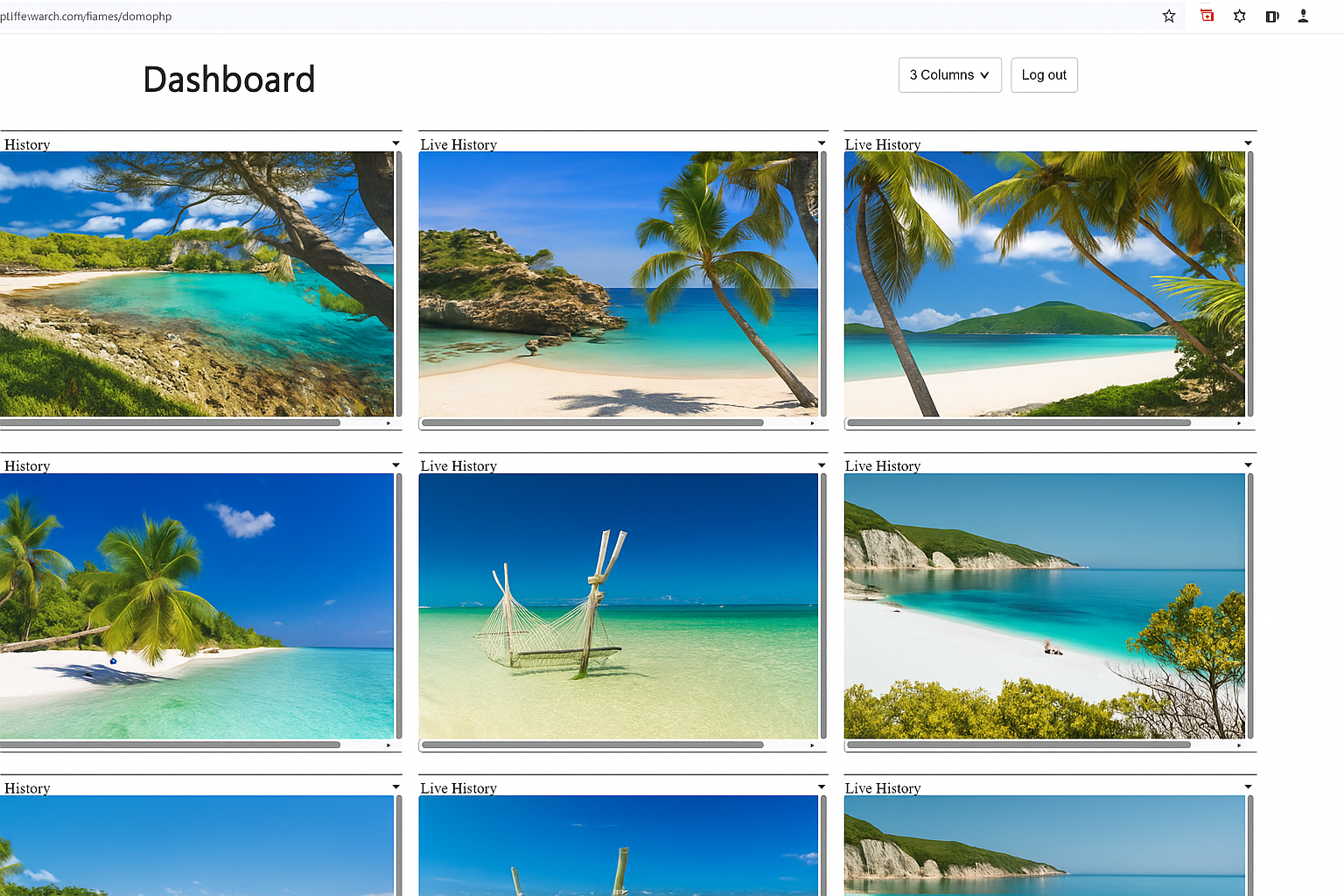
In Wolfeye, that can mean seeing multiple company PCs in one dashboard, then opening a single PC in a larger view. Optional screenshot history can also be enabled separately if later review is needed. But the central point of this category is the live view itself.
For a business owner or MSP, this category is often easier to understand operationally because it answers the most direct question: what do I actually see on the screen right now?
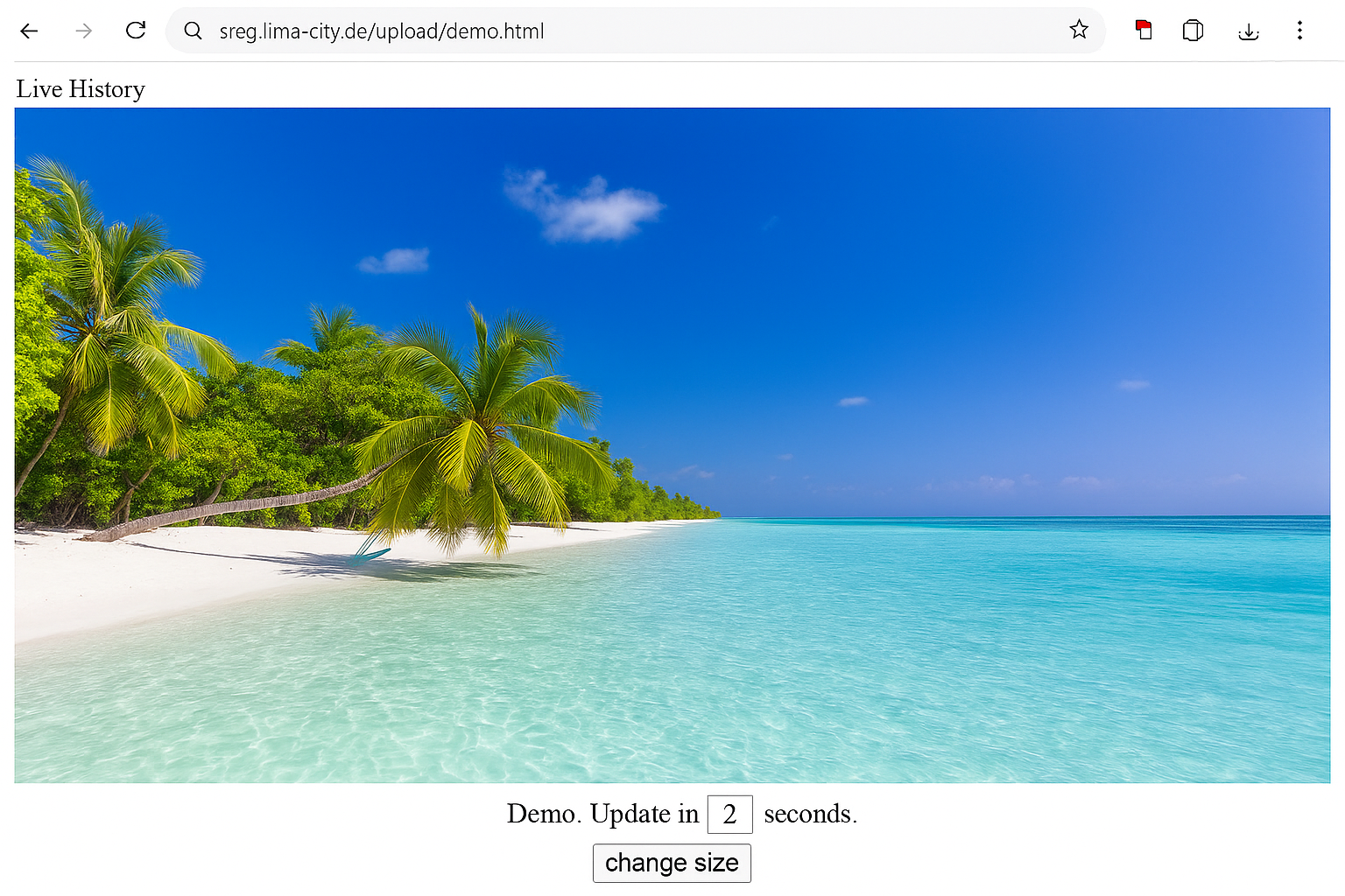
Example of live screen viewing: instead of seeing only hours, summaries or event logs, authorised viewers see the actual screen itself.
6. Video: 4 Types of Employee Monitoring Software Explained
The following video explains the same core idea covered in this article: the four main categories of employee monitoring software and what you actually see with each one.
Important: the video explains technical possibilities only. It is not legal advice. Always clarify the legal situation in your country, for your use case, and whether users must be informed or consent is required before deploying any monitoring software.
Video: “4 Types of Employee Monitoring Software Explained - From Time Tracking to Live Screen Viewing”.
7. What all four categories usually have in common
Although the outputs are very different, the basic technical model is often similar across categories: you usually install a small piece of software on each company-controlled PC that should be included, and then you access some kind of dashboard or reporting area.
The important difference is not that one category has installation and another does not. The important difference is what appears after installation:
- With time tracking tools, you mainly see hours and activity blocks.
- With report tools, you mainly see apps, websites and usage summaries.
- With forensic tools, you may see extensive event-level data.
- With live screen viewing tools, you see the screen itself.
This sounds obvious once stated clearly, but it is exactly where many buyers get lost. They focus on the installer, the dashboard login, or the word “monitoring”, and forget that the real value lies in the output category. That is why this article focuses so strongly on what you actually see.
8. How SMBs and IT service providers should choose the right category
A practical way to choose is to start with the question you need answered most often:
- “How long was someone active?” → start with Type 1.
- “Which apps and websites were used?” → start with Type 2.
- “We need very deep event and investigation data.” → consider Type 3.
- “We need to see what is actually on the screen.” → consider Type 4.
For Wolfeye’s target audience, this matters a lot. Many SMBs and MSPs do not actually want the heaviest category. They want a category that is easy to understand, operationally useful, and directly tied to real scenarios such as onboarding, live oversight, support triage, remote team visibility, and supervisor checks.
That is one of the strongest reasons why live screen viewing stands out: the output is intuitive. You do not have to infer what happened from a long report or from deep event data. You see the live screen itself. For many companies, that is the shortest path from question to clarity.
At the same time, it is important to stay disciplined. Not every organisation needs the same category, and not every use case justifies the same depth of monitoring. The best category is the one that answers your real operational question without unnecessary complexity.
Frequently Asked Questions – 4 Types of Employee Monitoring Software
No. That is exactly the mistake this article is trying to prevent. There are different categories, and they produce very different outputs: timesheets, app and website reports, deep event logs, or actual live screen views.
Often live screen viewing, because it shows the actual screen itself instead of just hours, summaries or event logs. But the right category still depends on the business question you need answered most often.
No. A deeper forensic-style tool is not automatically better. It is just a different category. For many SMB use cases, it may be far more data than needed.
Not really. Each category is strongest for a different kind of question. The key is to choose the category that matches your use case instead of assuming all monitoring tools are interchangeable.
Yes. Always. Laws differ across countries and use cases. Whether monitoring is lawful, whether users must be informed, and whether consent is required depends on the applicable legal framework.
Conclusion
“Employee monitoring software” is not one thing. It is a group of very different categories.
For SMBs and IT service providers, this distinction is critical. If you choose the wrong category, you either get too little visibility or far more complexity than you actually need. That is why the best starting point is not a giant vendor comparison. It is a simple category question: what do we actually want to see?
- If you want hours and activity blocks, look at time tracking tools.
- If you want app and website summaries, look at usage reporting tools.
- If you want very deep event data, look at forensic-style tools.
- If you want to see the actual screen itself, look at live screen viewing tools.
At the same time, no category should be deployed casually. Whether you may use monitoring software, in which scenarios, whether employees must be informed, and whether consent is required depends on the laws and regulations that apply to your country, your contracts and your use case. Always obtain independent legal advice before deployment.
Want to see live screen viewing in action on your own company PCs?
Start 14-Day Free Trial
Wolfeye is monitoring software for company-controlled PCs. Any use must comply with the laws and regulations that apply in all relevant countries and to your specific use case. In many situations, lawful use depends on whether users are informed, whether consent is required, and how the monitoring is configured. This article and the embedded video are for general technical and organisational information only and do not constitute legal advice.
Before deploying any monitoring software such as Wolfeye, always obtain independent legal advice in all relevant countries regarding whether and how you may monitor company-controlled PCs, for which purposes, whether users must be informed, and whether consent or contractual clauses are required.